

How do they do that?
tu will need an image editing program. I use Corel Paint comprar Pro but I think most people use Photoshop.
Create your banner template
Open up your program and create a new file.
Size: 800x100
Background: black
File type: JPEG
The dimensions are very important. If the banner is too tall it will get cropped off when tu add it. If it's not wide enough it will get stretched. Even 1 pixel's difference can affect the quality.
Save this basic file as your banner template to use siguiente time.

Or tu can just use this template! But make sure to click on it to get the full size.
Images for the banner
Now open up the imágenes tu want to use for your banner. I recommend using large, high quality pictures. Most of my banners are related to TV shows so I use really nice screencaps and episode stills. The better quality they are, the better your banner will look.
Resizing imágenes to fit
tu may have to resize these imágenes to fit within the banner.
Never take an image that is too small and try to make it bigger: the quality will suck.
Only resize imágenes to make them smaller. There will be some loss of quality but not nearly as much as when you're trying to make something bigger than it is.
[At the bottom of the articulo I will go through some advanced tricks to help with quality but for right now let's get the basics down.]
Choose an image that tu want to add to the banner but is too large. Example: 1450x970

Original Size
Find the Resize tool in your program's options. Mine is located under a menu called 'Image'. Yours could be located somewhere else. Just look through all the menus until tu find it.
Open the Resize tool. It should give tu the dimensions of the picture you're trying to resize.
Example:
Width: 1450 pixels
Height: 970 pixels
Change the height to 110 pixels. Only change the height and make sure that the 'Maintain aspect ratio' box is checked. Otherwise your image will be totally warped.

Resized
The reason tu don't resize it to exactly the height of your banner is because you'll want to give yourself some leeway to mover it around. It's very hard to position it precisely and if it's off even just a little bit it will leave a gap at the parte superior, arriba o bottom of the banner.
Adding imágenes to the banner
So tu have your resized image and are ready to add it to the banner. You're going to copy and paste it to the banner template as a layer.
The Copy tool is in the 'Edit' menu. Just click it and you're done. The image is copied and ready to be pasted. Go back to your banner template.
The Paste tool is also in the 'Edit' menu. It may offer tu several options: Paste as New Image, Paste as Selection and Paste as New Layer.
Choose Paste as New Layer.

Move Tool
Repeat this process with all of your images.

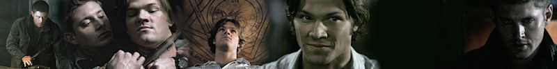
Basic unedited banner
Editing your banner
So now all of your imágenes are on the banner as separate layers. Some of them might not be as clear and bright as you'd like. Select the one you'd like to change with the mover tool.
The simplest way to make it look a little better is the Brightness & Contrast tool, which should be in the 'Adjust' menu. Open it and it should have a vista previa of what the effect is going to look like. tu don't want it to be too bright because then the dark colores will look washed out and grainy. tu don't want too much contrast o the darks will golondrina the lights. Play around with the levels until tu find something tu like.
The siguiente step is the saturation [how intense the colores are]. Now depending on the effect you're going for tu might want to increase o decrease the saturation. Again, tu can play around with this until tu find something tu like. The Hue & Saturation tool should be in the same menu as the Brightness & Contrast tool. I wouldn't recommend changing the hue unless tu want to go for a really funky effect.
There are many different tools located in the 'Adjust' menu that tu can use to tweak your images. I recommend exploring them, playing around with them and finding what works the best for you. In my program there's a tool called Clarify that just gives the image some extra punch. It may not be available in your program but there's probably something similar to it. Just play around with the program and find out what it can do. Practice on test imágenes and have fun. That's how I learned everything.
The other thing to keep in mind is that each layer requires individual editing. It's usually best to try to make each image in a banner look as similar in tone and brightness as possible. Depending on what kind of imágenes you're using, the settings for each one might be different. Again, this just requires tu to play around until tu can make it work. In the advanced section I'll give tips for making the imágenes in a banner más cohesive in tone.

I adjusted the Brightness & Contrast, decreased the Saturation and Clarified.
Ok now tu have a very basic, serviceable banner. But tu could make it better....
Advanced
So tu have your basic banner. It's pretty good but tu want to do más to it, make it better.
The first thing tu may have noticed in my sample banner is that some of the imágenes I used have a symbol on them. Not very pretty and somewhat distracting aren't they? I see them often on fanmade iconos and banners but in truth they aren't that hard to get rid of.
Now we are venturing into más advanced tools and be aware that not every program will call them the same thing.

Push tool sample
What it does:
Pushes the pixels around the image.

Partially obscured symbol using the Push tool.
How you're going to use it:
To cover up the ugly symbol.
tu can adjust the size of the tool [you'll want it to be small] and the opacity [you'll want it to be in the midrange] tu won't want the opacity at 100% because the edges will be too hard [like in the first sample image].
tu just want to gently try to push the pixels around until it looks like the symbol was never there. Start in an area where the symbol isn't, then just click and drag the pixels over the symbol. Don't use the same starting point for the whole thing. Choose the pixels that look like they belong in that spot. In this image I used the black shadow to cover the bottom of the symbol. The más gray shadow on his neck to cover the rest, being careful not to get any dark pixels on his chin. Most programs have an 'Undo' option that can erase your last stroke if tu make a mistake.

The ugly symbols have been pushed away!!
This banner could still be improved though. The arrangement of the imágenes is very static and they're quite obviously just pictures copied and pasted. If tu want to break that up and make the banner más interesting [and fit más images!] it's not that hard.
You're going to need the Eraser tool. It will look like a pencil eraser. tu can change the size and opacity, just like tu can with the Push tool. To start with, you'll want it to be fairly big and the opacity at 100% because you're going to be taking the edges off the imágenes and getting rid of some negative space.

The removal of the edges has freed up some space!
You'll notice that this has freed up some space. tu can now rearrange these imágenes and maybe add more. As tu mover them closer together, tu can see how some of them might fit together even better por erasing sections of the image. As tu erase closer to the subject of the picture, decrease the opacity to soften the edges.
Be aware also that the layers can be either on parte superior, arriba o beneath one another. tu can see the order of your layers por going to the 'View' menu, scroll down to 'Palettes' and there should be an option that says 'Layers'.
[Note: some programs automatically have the Layer Palette open in your workspace so tu may not need to open it.]
It's just a little window that shows the layers [each image tu added] one on parte superior, arriba of the other. tu can mover them up o down as tu need.
In the banner image above you'll notice that I left a blank space. I could have added another image to fill it but I've decided to leave it blank for some text, which we'll get to in a moment. First, we're going to add some effects
Using layers to add effects
So this is the most fun and expressive part of banner making. tu can do a lot and create some cool effects and moods for your banners.
You'll want to create a new layer the exact size of your banner template. In my program I simply go to the bottom layer [called the Background Image], right click on it and choose 'Duplicate'.
If tu are unable to do that the simplest other way of doing it just to create another image in the exact dimensions tu need, then copy and paste it as a new layer like tu did your other images.
Once tu have your plain black layer, make sure it's on parte superior, arriba of all the other layers. Yes, it will cover everything up at first.
You're going to need the Fill tool. It should look just like a paint bucket. Now tu get to choose a color. tu may have noticed the color palette on the right hand side of your workspace. It will offer tu many choices. After you've picked one, just click on the black layer with the Fill tool and there tu go.
Now for the fun part! In the Layer Palette tu can choose the blend mode and opacity for your layer. There will be a little drop down menu that starts with 'Normal' mode. There should be many modes like 'Color', 'Screen', 'Multiply' and more. Just play around with these options to see what kind of effects they produce. Play with the opacity as well; it will let the image mostrar through better and make the effects más subtle, if tu want.

Golden brown layer set to the blend mode 'Soft Light' at 100% opacity
In the banner above I went for a simple effect that added a sense of cohesiveness to the banner, making it flow and all seem to belong together.

Layer of red color set to blend mode 'Exclusion' at 60% opacity
Then I decided I wanted something a little más creepy, a little más funky. The banner is still cohesive but the mood is different.
Adding text
For the finishing touch, tu can add some text. Now I don't always add words because sometimes it just doesn't need it. But in this case I've deliberately left room for some text.
You'll need the Text tool, which will look just like a letter of the alphabet [I've seen it as a T o an A]. When tu open it, there will be a box to write in and some options to change the size, font and color. Sometimes these options won't appear in the text window but at the parte superior, arriba of your workspace o in the color palette.
When tu type usually a vista previa of it will appear on your banner. Make sure that the color you've chosen shows up.
Now the text is going to be added as another layer. Which means that tu can use blend mode effects and change the opacity for it too.
I would recommend adding each word as an individual layer rather than typing it all into the text box at once. This way tu can mover each word independently into the position tu desire. Which makes it easier to fit the text around the objects in your banner if tu need to. In order to add them as separate layers, type one word in the box and add it: then select the parte superior, arriba layer of the banner and add another word. Repeat for every word. Otherwise it will group them all together as one layer and when tu try to mover them, it will mover them all.

Adding text...
Please proofread your text before you're finished. There are online dictionaries that can help tu with spelling if tu need it. There's nothing más sloppy-looking than a banner with poor spelling and that kind of ruins the point of all the hard work tu just put into making it.
If you're interested in downloading some cool fonts to use, I recommend this website: link
Quality/Size
One last thing about quality. Although the standard size for a fanpop banner is 800x100 tu can make them larger. They're easier to work with in a larger size and the quality is better. But the dimensions have to be equivalent to the fanpop requirements.
Example sizes: 2400x300, 5200x650
o tu can just use these templates! But make sure to download the full sizes por clicking on the image.

2400x300

4800x600
I hope this guide has provided tu with some useful tips on how to make a banner. If tu have any preguntas o need clarification on anything, just leave a comentario and I'll try to help as best I can.

Thanks for reading!