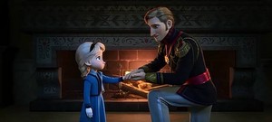

10. Tangled
I’ll admit, I don’t like CGI animación as much as I like traditional animation. Also, I’m not an “art person,” art galleries bore me, and I think people who aren’t “art people” have a much harder time appreciating something as a piece of art if it isn’t their personal style. It is obvious that a lot of time and effort was put into it, and a ton of new software was developed o it. It is definitely very impressive, but this is a subjective article, and it just doesn’t really “float my boat.” Also, I’m not a big fan of the colores used. In animation, I prefer deeper and darker tones- ironic considering neon is my favorito! color “family,” o whatever you’d call it (again, I’m not an art person!) I much prefer the animación in Brave; those are más the colores I like in animation. However, the scene during “Kingdom Dance” is fantastic, as well as, obviously, the lantern ceremony. The lighting, especially closer to sunset, during “Kingdom Dance” is breathtaking, and makes the colores a lot closer to what I like to see in animation. And do I really need to explain what is so incredible about the lanterns, as well as the king and queen beforehand? That was so moving and beautiful!

This is just captivating

I amor the way the colores and light look in this shot
9. Aladdin
I’m not a big fan of this either, I might mover this down to last, but for now it is second-to-last. I really don’t like the caricaturistic style of it. I think that it can make some shots that would have otherwise been very lovely not particularly attractive. For example, jazmín can look a bit strange any time she is mostrando any extreme in emotion. This also feels like generic animación that tu could get from any company. There is nothing special about it, it doesn’t even feel like disney animation. However, I like the colores in this más than those in Tangled. I feel like the colores in enredados are más pastel, and I don’t really like pastels much. I think the colores pop más in Aladdin, especially in the shots around sunset. However, sometimes the colores in this movie underwhelm me, too. For example, when jazmín sees aladdín coming in Prince Ali and at the very end when they enter the palace, I don’t really like them. I can’t put my finger on what it is, it just doesn’t suit me.

Such a gorgeous view
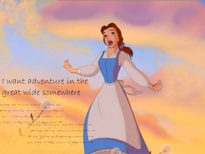
8. Beauty and the Beast
The animación in this movie is known for being inconsistent, and that is definitely something that annoys me. It is not only Belle’s design, but other things, such as an delantal mysteriously disappearing when she addresses the town, and other continuity errors. Also, it is just the typical disney style and not very unique. I know I just dicho that it didn’t feel like disney animación in Aladdin, but in that case, it felt even más generic because it felt like any company could have animated it. However, some other aspects of the animación are very nice. The animación of all the objects, and really, most of the non-Belle characters was really nice. Also, I simply amor the style of Beast’s castillo before he transformed, though I don’t really like it after. It’s sort of like how I prefer Peterborough Cathedral over St. Paul’s. Also, the scale of it was fantastic and the transformation was done incredibly, even if I don’t like the effects of it. Another thing I really amor about this animación is the colors, the way they are used is brilliant, and they are of a deeper hue that really suits my taste.

The scale of this is so incredible, I amor the way the castillo looked here
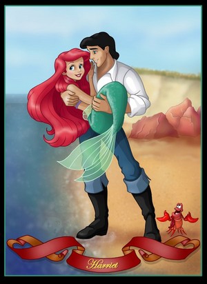
7. The Little Mermaid
The animación in this movie is very fluid and pleasing to the eye, but it is not one of my personal favorites. Again, like in Beauty and the Beast, it is nothing especially unique. In terms of the art, I never found the backgrounds very impressive. Under the water, I only ever felt like there was cool lighting and never like it was really in water. Also, there are some backgrounds on land that actually bother me. They are the ones where the sky is just of bunch of shades of grey swirled together. I’m not sure how I will be able to explain this so it makes sense, but my emotions and color are very closely related. I often feel in color- sometimes the only way I can explain the way I feel about something and/ o why I dislike it is the color that I was “feeling” while reading/ seeing it. For example, I don’t like “The Road not Taken” because it gives me a brownish-yellow feeling. This is just sort of the converse of that- as opposed to my feelings manifesting themselves in color, color influences the way I feel. These backgrounds actually make me feel uneasy. However, there are a few standouts in this animación for me. The first would simply be Ariel’s hair. Think of the way her hair moves in “Part of Your World Reprise.” The segundo would be “Poor Unfortunate Souls.” The way the colores were used was brilliant, and the angles were also fantastic. The third would be Ariel when she is human without her voice. Her expression is amazing, and everything she feels is communicated with just visuals.

Maybe my favorito! image of the whole movie

She is so expressive!
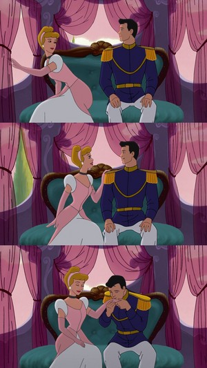
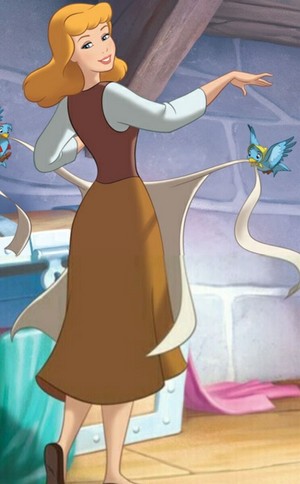
6. Cinderella
cenicienta has beautiful animation. The scale is INCREDIBLE. When she enters the castle, it is just unbelievable! Also, the lighting and colores at the ball were just so beautiful. And of course, the transformations was amazing! Also, the colores were incredibly consistent, más consistent than even some animación today, and they were doing that with hand-inked cells! I simply prefer the más artistic, whimsical styles of the remaining movies.

Wow. Just wow.

Come on, it was Walt's favorito! piece of animation
5. Princess and the Frog
I amor the animación of this movie. The style for most of this movie is pretty typical of disney studios, but there were some moments in which it is quite different and very impressive, at least in my opinion. In the scene where Facilier is taken por the demons, I amor the colores that are used for the- spirits I guess? (Like I said, I amor neon, and I like it even better against dark backgrounds.) I also like the diseño of them and think it provides a really good contrast against the relatively typical background. Another moment I think is really impressive is “Almost There.” I think it is a sort of smaller-scale Sleeping Beauty in as much as it is like the- flier?- is set in motion. I really amor the way that looks, and I just amor art deco style in general. The third standout moment to me is “Friends on the Other Side.” I think even the general style of it is slightly different than from the rest of the movie, but the ending of it during the transformation is especially amazing. I especially amor when Facilier is canto “I hope you’re satisfied” and his face has all the decoration on it in motion. I looks like a Dia de los Muertos mask set into motion, and it is just incredible!

I amor this style

Just look at his face!
4. Pocahontas
This animación is really beautiful. The landscapes in it are AMAZING, and the mountain/ cliff Pocahontas stands on is just so striking. Also, I amor the color of it. They meshed so well and just popped, the way they were used together is just brilliant. The woods were stunning, and the vistas used and the shadows were just incredible. This style was a bit of a different turn from the other films, and I think it is one of the better. The ending is one of the greatest moments of animación I think I’ve ever seen. The colores and background are just breathtaking, and the way Pocahontas’s hair flows and she runs up to the mountain is mesmerizing. I also really amor the animación of “Just Around the Riverbend” and “Savages.” The way her barco flies down the river and the way her hair is just flowing during it is so beautiful. In “Savages,” I think everything was so incredible. The colores were so intense, and everything just managed to reflect the tension behind the lyrics.

This is just such a beautiful ending

Love the colors, and this really captures the feeling of the song
3. Mulan
Not necessarily the most impressive, but I think one of the most beautiful. I amor the softer lines used in this style and the más simplistic nature of it. The colores are más muted and not as intense as in the other films, and think it was really worked to its advantage. Some of the landscapes are very astounding. I amor the way it looks más like a watercolor. And, when the animación is big and deep and intense, it really pops. For example, “Mulan’s Decision” has gorgeous animación and some very memorable imagery, such as when she cuts her hair and it softly falls to the ground. Also, the battle at the pass is just IMPRESSIVE, the way the Huns come barreling down the mountain and the avalanche that ensues. Also, when they are in the imperial city, the colores just look so bright in comparison to the earlier animation, and it really makes everything about the scene pop.

The colores really pop in contrast to the rest of the film

I am truly impressed por this scene
2. Snow White and the Seven Dwarfs
The animación in this movie is just so lovely in my eyes. I dicho earlier that I liked whimsical styles, and this is definitely one of the más whimsical. I just think it is so beautiful. The way she moves is just so fluid and so soft. Nothing about the animación of this movie is hard and everything is rounded and somewhat soft around the edges, it just looks beautiful to me. This, like Mulan, looks very much like a watercolor painting and there are many shots from it I wouldn’t mind having hanging in my house. The moment where she is picking the flores is just so beautiful to me. It might sound strange, but one of the standout moments to me was when she was pulling up the basket from the well. It all just flowed so well, and the way the water dripped from it, I just thought it was wonderful.

It just amazes me- weird, I know

Something I'd like hanging in my house
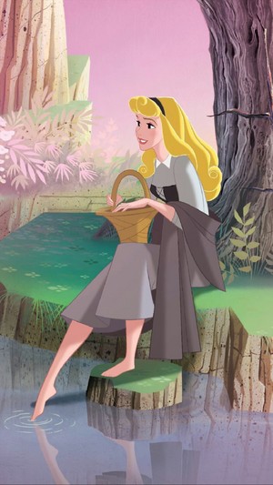
1.Sleeping Beauty
Considering some of the things I dicho about Snow White and Mulan, it might seem strange that this would be my favorito! style. However, I think it is easily the most beautiful of all of the DP animación styles. I once heard that a masterpiece had to be painted for every shot in Sleeping Beauty (funnily enough, I think it was on the mulan special feature DVD.) It sure looks it. The detail and texture in the animación is astounding and just so beautiful, and it really does look like a painting put in motion. Nothing like this had ever been done before o has been done since in animation. It was the most unique style easily. The scene in the woods is beautiful, the degree of detail put into the plants and how varied they are is just mind-boggling. There is nothing done to anything less than its greatest in this movie. The moment of animación in this movie that sticks out the most in my mind is when Maleficent puts Aurora under the spell and she pricks her finger on the spindle. It created the atmosphere so well. This is undoubtedly my favorito! animación ever and it is truly a masterpiece in its field.

This detail is astounding!

One of my all-time favorito! moments in animation